
I also looked and noticed that all the walls are a plain neutral white except the back wall witch is stones. this got me thinking about how bright/ dark to make my pieces so that it would complement its surroundings as I am creating a wall paper sample.
Research.
Before starting to think of any ideas, I've been researching William Morris and found he was the founder of the Arts and Craft movement in the 1880. And Pablo Picasso who was one of the creators of the cubism movement (along with Georges Braque's) I found that I had set myself a rather large challenge to combined both of their styles to create a different style. I first thought that Williams art work was extremely detailed and cramped witch began to make me doubt my artists capability for this project as I had never attempted something so detailed and full. However when I was looking at Picasso's work I found I preferred his Blue period rather than his more commonly known cubist work. I started to think about how I was ever going to do this project.
 I decided to search around on the internet for artist research before starting any of my own ideas. I came across a couple of quotes that William and Picasso said in there lift time that made me rethink this project and give it a try here are the quotes I found. these quotes helped me to fill my first two pages in my sketch book and do two pencil portrait of William and Picasso and have a quot under them.
After reading theses and having them in my book to keep reminding myself I then began giving this project my all and found that what I thought and suspected to be difficult came rather naturally for me. And I began filling page after page in my sketch book with ideas and wall paper samples that I got from BnQ and Wilko's in Barnsely. As I was in the shop i came across some wall paint sample pots as I found that resonantly it has been discovered Picasso used common wall paints for his art work, which made me want to do a couple of sheets of critical study on Picasso's work. and I ended up with this
 on this
I found that wall paints came very easy for me to use than most paint type media that I have used before. And it is defiantly a media I would use again in the future. It was also after doing these two sheets that I decided I wanted to focus on his blue period so I did a little research into his blue period and put it into my sketch book.
research out of the way; I then followed the next step on the design cycle and began to plan out different ideas for a final piece into a second sketch book. I was really set on making a self portrait with floral hair as I didn't know any other way to combined there two styles however after I had spoken to David (My client) and he said he'd like to see floral designs like Williams but have them in all shades of blue and make them sketchy like the style of Picasso's blue paintings witch got me thinking and got to work on that straight away so I wouldn't for get it and after a few quick sketches in pen and Indian inks I showed David before he left and we both agreed this was a lot better than my ideas previous. after we talked and figured out what would look better and what David wanted to see I got straight to work creating samples for my final piece these consisted of Lino, screen print and etching as well as a breath one day in the Ceramics room as I wanted to try making flowers and a floral style in clay as I found Picasso also dabbled in ceramic work.
Experimenting
CERAMIC'S
 As I found out that Picasso also had a lot of ceramic pieces I decided to try it out myself and create flowers out of the clay after walking to David about making flowers like Picasso's blue period. as you can see in my photo all the flowers look quit cartoon like and laid back. Witch is my opinion on what Picasso's blue period looks like.
 First I grabbed a lump of clay out of the pot and began rolling it out using a rolling pin and two wooden guides, both the same thickness to make sure my clay is evenly thick.
I found this part rather boring but necessary as with out thinning the clay I wouldn't be able to make the base for my tile or fold and mold the clay for different samples.
 after rolling my clay out i then placed a red fabric square onto my clay to show me the size of the tile that I wanted. Afterwards i then used one of the wooden runs and a clay knife to cut around the square neatly for the base of my tile.
After I ave my square piece of clay I then used the excess clay and a circular cookie cutter that we use in the ceramics room I placed it onto the edge to give me a semi circle and then cut it out again shown on the photo to the left. this was shown to me by my ceramics tutor and this is one way to get a smooth petal/leaf shape out of clay.
 I found using the cookie cutter was a loot easier and neater than trying to make the leaf shapes by hand. however I also found calving the shapes out of the excess clay with the clay knife is a good way to create a leaf as well. In the picture to the right I av not yet fixed the leaf shapes down I am just placing them and starting to plan out where to put each shape.
 searching threw the basket of objects that can add patterns and sometimes texture into the clay I found this interesting as it looks like an abstract sort of flower. Id also like to point out in this pic on the left you can see what the stamp looks like on my piece of clay and another position that i put my petals in to see how it'd look.
I also found this interesting looking piece in the basket. I decided to push some excess clay into it and then pull it out to see what shape and effect I would get. I was very impressed with the effect as it looks like a rose, after taking this pic I used the knife to get rid of the extra clay around the now shaped part. (The stamp and the rose shaped thing are both made out of clay that has already been shaped and heated)

I also found a star shaped cookie cutter and decided to cut a few star shapes out and then layer them up as shown in the photo to the left and then used the end of a pencil for the circle' in the center, I found that this made them look like flowers but not only that the one on the right reminds me of Picasso as it doesn't look like your typical soft curved petaled flower.

all that I have explained n photographed has given me this end result.For the flower in the center I cut petal shapes out using the knife and carefully positioning them over lapping. (This took me quit a bit of time as I wanted to get it even and neat afterwards used to pin tool to scratch the lines into the petals giving it a more textured look.
This is the furthest I have currently got with my ceramic pieces as I found myself starting other things and getting more interested in them as they are more important than these few ceramic samples however I will post photos with information on how I did them when i have chance to finish them.
All the piece of clay are stuck together using "SLIP" which is just old bits of clay and water, before putting the slip on you need to scratch lines into the pieces you are sticking down and scratch into the piece you are sticking it onto before using the slip as glue to stick them together. (this can be very messy so be sure you wear an apron and remove any jewelry off your fingers.)
LINO PRINTING
When doing Lino there are a few safety rules that you need to know.
- When calving your pattern out of the Lino always make sure you calve away from your hand and fingers as the tools can be very sharp and can give really deep cuts (as i have found in the past)
- It is better to use a Bench Hook as it prevents you from cutting into your work surface and also while calving away from your hand stops the blade going too far if your hand slips as it will just hit the batten that is on the top and bottom of the hook at opposite ends.

The reason I decided to try Lino printing again is because I found William Morris had used it a few times for his work and I also wanted to see the effect that I would get trying to create wall paper samples from a piece of Lino and how hard it would be to get a repeated pattern from a piece of Lino.

This photo was taken by my friend in class as i needed both hands to work into my Lino. This is the first Lino I did within this project as i forgot to take a photo of my cutting my final Lino piece, However i will upload a photo of my final Lino later on. As you can see in this Photo i am Using the bench hook and calving away from my hand i found this very annoying as I ad to keep stopping to turn my Lino round for the curved parts.

In this Photo you can seen that the inks I prefer to use for Lino printing are water based, I prefer these as they are much easier to clean up afterwards and are a lot easier to wash off your Lino than oil based inks, they also don't stain your skin for as long. In this photo I have got two different shades of blue, a white and a black water based ink colours this is so I can get different shades of blue as I am trying out William Moriss style floral patterns with the blue shades of Picasso's Blue period, However I do try my pattern in different natural colours for a bit of fun experimentation afterwards which I will shoe the photos of them as well.

First I squeeze some ink onto a large glass surface (As its easier to clean ink off of) and I used my roller to spread the ink out evenly so it wouldn't be too thick

once my ink was rolled out I then used my roller and began rolling the ink onto my lino making sure it was evenly covered everywhere for the best result. (as you can see the ink being rolled onto my Lino is Black rather than the light blue in the photo to the left this is because I forgot to take a photo of me rolling the blue ink onto my Lino.

 Once the Lino is coated with ink I then placed it face down onto my paper were I want it,
 Secondly I placed a piece of fabric over the top of my Lino to add a little more pressure through the bed.

once your happy with where your Lino is and begin to turn the wheel to move your lino threw the bed. and after you will get a print like these...


I apologize for them being in group shots instead of individual however I am having some difficulty getting them all singular onto the blog and in appropriate positions. However in the photo to the right there is a print that is lite blue, This was not done by water inks but instead Puff binder from the textiles room to give a raised rubber type texture to my print just like some wall papers. i got this idea from a sample of wall paper in my sketchbook that i had collected.
 Pleas REMEMBER when printing wear an apron and gloves to prevent ink stains on your skin or cloths and also have you hair tied back to stop your hair getting into the inks.
screen printing.
I chose to try screen printing as it is another way some artists including Morris made/make wallpaper.
I have already done screen printing before as well as Lino. however as an artist you find that no matter how many times you do something theirs always something new you can try.
 Before you screen print there are a few things you need to do:
- (in my college I need to sign into the print room before starting anything)
- Make sure you have your hair tied back, gloves on and an apron to cover your cloths and stop the dies and pigments getting onto your hands.
- when using the pigments remember to put the lids back onto them properly to stop them dry up or even any spillages for the next person to use them.
- Keep your work surface as clean as possible so not to contaminate any other work with inks and pigments
- when using the jet wash to clean your screens don't point it and any body or anywhere besides at your screen ans squeegee.
- when placing your screen into the heat cupboard remember to place it properly onto the rack and don't leave the door open.
This time i wanted to try out a few back grounds to print my screen onto instead of just plain blocked colours like white, black, etc, whereas this time I used dies on plain white paper and also a colarge.

First I used these cups to measure out my dies so that I could keep notes on of it in case I wanted or needed to do it again with the same colours. I desided to use the big one witch is about 50ml. to create my colours I used 50 50 to get an even colour however somtimes I found I needed to ad an extra 25 in if the colour wasnt quite the shade I wanted.

 I decided to go for a green colour as my pattern is floral and I thought the green would complement and match with the pattern I also wanted to add a bit more colour so I added a few splashes of red onto my back ground to break from the green I used the red from college and the wrong end of the paint brush and just splattered the red onto the paper like that and I found this rather therapeutic for me.
 I then decided to use the same green I had made (to prevent wasting) and drew a flower that looks somewhat cartoon like as I remembered that David (my client) said he wanted to see more floral patterns in the kind of style Picasso would have probably done them in his blue period.This was done by one of my paint brush and the yellow die that was in college already I found it a little challenging as I felt like it looked rubbish as it was painted straight on without being drawn out first and I was trying to loosen up as Picasso's work is loose and expressive, I don't thing this flower is very expressive but I would say it is quite loose n laid back
For this background I decided to use bits of news paper and tissue paper to create a collage to print onto, to see what effect it would give with the print. As you can see I forgot to take a photo of it before I printed but your can see that the colorful back ground really makes the black pattern stand out which is the effect I wanted. I decided to use bright colours and fairly bold straight edged shapes, as I just wanted to try my own version of Picasso's cubism with the bright blocked colours as I was curious and even though I knew I wasn't going to be used for a final piece I'm glad I tried it as I know know for future porous that screen printing onto collage does work out rather well.

After I had made my backgrounds I then placed them to dry on the drying racks out of the way so that I could clean my area, ready for actually screen printing and get my pigments ready.

 When making your pigments to print with you need to use "Binder" a white looking substance that is actually clear but helps the colour for your print to thicken and actually print properly.
When choosing the colour for my pigments I find its a good idea to take notes as there can be a few shades of the same colour (For example : Brilliant red and Rubin red) each pigment pot also has a code after the color such ad (BR, R ,ect.) it is important to take note of that as well in case I need to repeat a print again in the same colour for my client.In the photo to the right you can also see things that look like tong depressors or lollipop sticks these are what I use to mix the colour with the binder, However when I do this I only dip the tip into the colour as you don't need a lot when mixing with binder as I have found out in the past.
 Once I have got my pigment mixed to the colour I wanted in a plastic cup I then place my screen over one of my background (when completely dry) and then place a bit of my pigment onto my screen just above my patter. when ready I then use my squeegee dragging the pigment ink down then back up to make sure I'v printed all of my pattern and got the right amount of colour threw. (sometimes I have found it is easier to use a couple of weights to hold my screen still as it can sometimes move when dragging my ink down which can effect the outcome of my print.
 I repeated this for the rest of my prints with the same colour on the back grounds here are the end results to those ones...
As you can see the one with out a back ground looks fuzzy, This is because my screen hadn't full dried and I tried adding a little bit of red into the print along side the black the dampness of my screen made the print look fuzzy but I kind of like this effect as it gives me a Gothic psychedelic feel that iv not seen before but think it works well.

This black print on a plain white back ground is less fuzzy than the other as this was my first print to make sure my screen worked and is the pigments worked on cartridge paper which from this experiment I now know they do.

 I also tried screen printing a self portrait with my original idea a portrait in the style of Picasso's blue period but instead of hair have vines, leafs and flowers. this print what originally from a painting i did in my sketch book (Original image shown in the right photo) I also tried out something rather new to me with screen printing which is printing with a substance called "Puff binder" which unlike Binder allows you to create a raider pattern that feels somewhat like rubber by printing with it and then using a "heat gun" to create a reaction with the Puff binder that allows it to raid up.
As you can see it is best to rest your print onto something when using the heat gun as sometimes things off the table can seep onto your sheet in my case it was wax from the batik table I was on the messed my print up as well as holding the heat gun slightly too close where it almost burnt my paper (you can just see a yellow dot in the hair) however it was my first time using it and as mt Tutor says "your not likely to get it perfect on your first go" which is why I decided to try it on my Lino print that I showed you earlier on and it went a lot better than my first attempt.

I decided to work back into one of my prints with a pen coloring the lips and eyes in and adding minor detail like darker eyelashes around the eyes to make it look less like a brainwashed person. and I found I in my opinion just those minor changes really made the print better.

As a whole i found screen printing very relaxing and easy. I learnt a few things I didn't know before such as the use f puff binder and the dies and i will defiantly return to the textiles room to do some more experimentation and sampling.
Making paper.
Most of my class mates had made there own paper within the first year of college however due to personal evens I wasn't able to try it. But as soon as I had the chance to I made sure I found that this experiments wasn't really for people who don't like mess and getting hands in.
If you where to try this you should remember:
- use an apron to stop you cloths from getting messier.
- gloves aren't required but I would suggest them if you are using dies in the mix
- tie your hair back if you have long hair to it could fall into the mix and be messy.

 First I shredded the paper up rather finely and added warm water to it mixing it around. I found using my hands to mix it with was easier and better as i could tell when it was done. afterward you drop a handful into a tray of warm water wand use your hand to separate the mixture a little it is at this point i was told i could add die to the mixture however I wanted to make a plain white one at first. I was also told you can use kitchen roll as well and it is supposed to be better than ordinary paper.
Next i got a mesh tray and placed it into the water moving it side to side to get a nice even layer of shredded paper coating it. one i felt i had enough i pulled it out of the water letting the excess water drip off before placing it face down onto some cloth peeling the wet paper off and waiting for it to set placing it onto the drying rack after i had made a white piece I then used "Brusho inks" to change the colour of the paper. However I tried putting one onto the paper as it was still whet on the cloth and I then tried putting some ink into the water. I found it didn't really make a difference whether the ink was added to the water or onto the paper.
 here are my samples...
These samples are the ones I did with the ink in the water I also tried adding more texture to the one on the right as you can see.

The blue one on the left is the sample that I put the ink onto the paper as it was drying. I found this really fun but I honestly can't see myself doing this again as the paper was too thin and flimsy to do much with, although I might try making the white paper again and draw on it with colored pencils to see the effect i get but other than that I couldn't see the point in this after I had done it for myself.
Final Pieces.
after my research and experimenting I found that it could be best for my wall paper to have a back ground with different shades of blue with a black floral pattern that repeats itself. I Used my lino from my samples as I found that that pattern really worked.
I am currently decorating my bedroom and have plain white rolls of wall paper, I cut a bit off from the roll so then my final wall paper sample looked and felt more like an actual piece of wall paper.
as I was deigning the back ground I used masking tape to keep it rolled out and to prevent it wrinkling from the "Indian inks" I decided to water the inks down a bit so that the colours wouldn't be too dark so that the pattern would still show. I filled the cap off the inks with the Blue and poured it into a plastic cup I then poured water into the same same and added it then I began adding more caps of water for lighter shades until the background was covered I also used small bits of extremely watered down black ink to highlight some of the paler blue areas.
This is how it turned out...

I wanted to leave some white areas as Picasso's blue period really exaggerate the light and dark patches in his work however I couldn't exaggerate the dark parts of my work on this as it would distract from the floral pattern in the for ground.
The print bed that I had to use for my wall paper sample was originally set for etching prints but as the original Lino print bed was too slip for the width my wall paper is I had to ask one of my tutors to change the pressure of the bed so that I could use it.
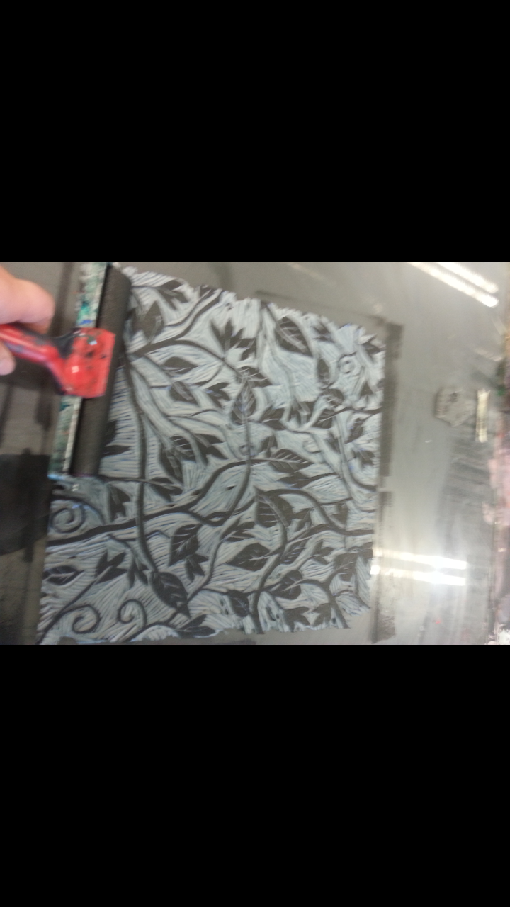
Once it had dried I then began rolling my water based inks out and covering my lino with the black ink

 I found this bit really needed some patients and accurate as i needed to make sure my pattern was as close to the edge of my wall paper as I could get it as i needed to place my lino carefully to mach the pattern each time I printed.
As show by these two photos.
I am very happy at the final out come as it has gone how I wanted and expected, and I can really see myself doing something like that in the future. If i where to do this again thou I would probably use a bit bigger piece of Lino to try and save time.
here is my finished wall paper sample...

My other final piece I decided to paint two canvases but this time I decided to paint the flowers in fairly depressive colours like dark blue, purple, etc as Picasso's blue period came around after the loss of his friend. I decided to use brush inks for my media as they seemed to work rather well with the mode of my painting. I have drawn the flowers loosely and with not much detail as that's how Picasso painted within his blue period. I found I wasn't quit as happy with the out come of this final piece as I am with mt wall paper sample As I feel its just not as good and looks slightly rushed. however I am very pleased with myself and the way I have handled everything in this project and I have proven to myself that just because I "THINK" something is going to be hard and I wont be able to do it, isn't always true and this project has given me the confidence boost I needed when it came to trusting my own capability.

No comments:
Post a Comment